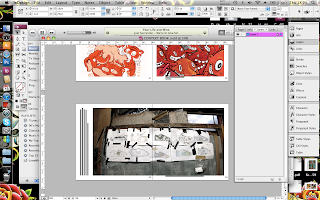
I really liked the way this layout flowed and just looked really natural and was an ease for the eyes.
It took me hours to work out how and what I wanted to include in my introduction, there were was a lot of different examples and layouts I attempted before I was happy but none of them seemed really right until I got to this one:
This first image is of fantasy artists very own, Ken Kelly. I included all the relevant information I gathered from research and quotes as with interviews I have taken over email but essentially this is the layout I want to carry forth with the rest of my book as the main focus is within the imagery and not the text, But the text is not left out.
At the bottom of the page on the right hand side I include a small bit of type informing what is on the page and who it is by.
Pale horse design were my main focus and I included some really inspiring double page spreads which were in my opinion 'sick'. Im not sure how they will look when lulu have printed it but fingers crossed it should turn out alright.
I wanted to add quite a bit of 3D work into my book to show that it is not all just a piece of paper and illustration can be manipulated in so many different inspiring ways.
Unfortunately I could not find the artist who produced this traditional tattoo art but just because of that didn't mean I did not want to include it in my book.
Lined up from the left contact list.


No comments:
Post a Comment