Blog Archive

Showing posts with label context book. Show all posts

Wednesday, 25 May 2011

Oh Lu Lu...

I have been struggling with uploading my PDF to my blog due to html sites not working correctly on my macbook.

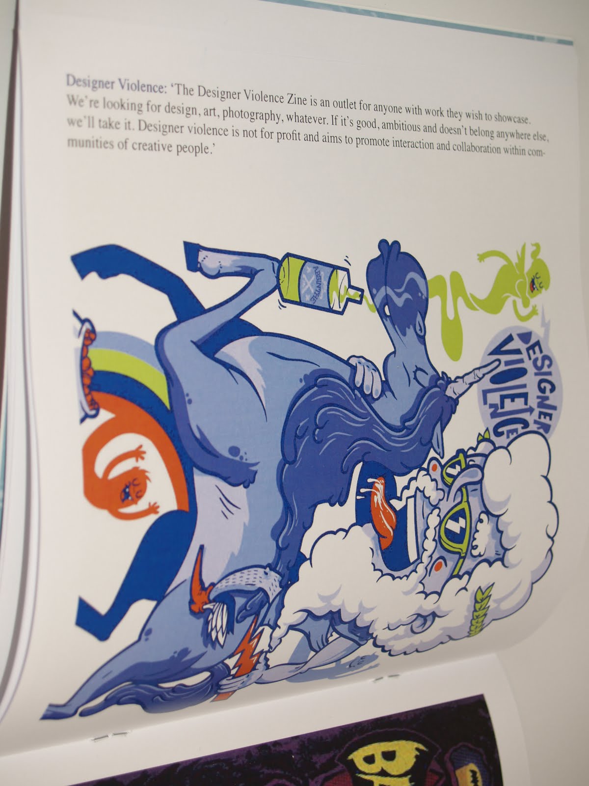
However I got the context book through the door the other day made by Lu Lu, unfortunately some areas of the book had came back incorrect and I was not to pleased by outcomes these areas include:

Spacing between type and photos on the bottom right pages.
Blurred front cover
High resolution photographs/ images being blurry

If I had time I would have the book remade although there is not enough time for it to be delivered to the UK in time for deadline, instead I will give a full evaluation on how the book went beginning to end.




Final Crit

The final crit was quite useful in regards of understanding what worked what did not and what had to be improved, the main thing I was concerned about was addressed in my questions which was DO MY BRIEFS MAKE SENSE.

luckily for me everyone who gave feedback could quite easily understand what was going on and gave me some positive advise on what needs changing and ideas of how it can be done.


Tuesday, 24 May 2011

Front, is a illustration based magazine which focus's on a collaboration between photography and vector illustration as shown in July's 2010 featuring Vikki Blows on the cover, I think that it is really cool to incorporate the theme of the magazine with the cover i.e. this theme was sex and ink, the sex appeal is covered by the model and ink is covered by old school traditional tattoo art, swallows, anchors, hearts and scrolls.

My cover will be based around all hallows eve theme.


I found some interesting illustrations featured in the magazine, a lot of the dps's focus on incorporating 80/90's legends and illustrating them in a crazy humorous kind of way.


Matthew Skiff is a talented illustrator/ graphic designer who has produced countless products for the magazine, I emailed him earlier today for some feedback on my brief and some tips/ some old themes that I could perhaps incorporate.


A lot of his work seems to be similar to the drop dead full colour brief I previously worked on, although these images seem to be 2 colour screen prints which looks really good.


Big type and incorporation with illustration, I love the way that it all works together as a big puzzle piece rather than a division by the middle of the page.


This is one of front's main illustrators, I really like this idea of working and may produce my 3DPS's based on a theme and labels like so.


Maybe a guide?


The main issue I have with this project is I need clarity and need to knuckle down and set a theme so I know what has to be done.


I love these illustrations as a set and have taken something like this into consideration as it fits my work a lot better than any of the above.


The dps is based on different crazy animals which are a nuisance.


I believe this type of theme would be best to associate my work with, I just need to think of a title in order to complete my brief and crack on with the project.


None of these themes are relevant.


I do not want to do anything based on bands.


And do not want to do something something like this, but I do want to produce something which is related to this time a year, Halloween and Bomb fire night.

Saturday, 21 May 2011

Front cover and inner covers + title

'The "wolf at the door" refers to any danger or predator that seeks to ravage the inhabitants within, ranging from starvation and poverty to physical death'

Pretty much sums up the world of illustration and graphic design.
I wanted a title which was an attention attraction with a deep meaning, the meaning of this is that no matter how good you are or think you are, there is someone better, so you need to fix up and look sharp when it comes to design, you cannot live on the glory of one piece of 'good design' forever, you constantly have to be thinking, whats next!

I chose to use the cover image manipulated in photoshop as the first few pages.

The cover is of Daniel Mumfords wolf illustration which deemed appropriate due to the fact he is a chapter within my book and well, their wolves right!?!

As I printed on LULU it meant I had to choose a template, so I had to shorten the image down to a weird size leaving a stripe at the top. I chose to make the back black and keep main attraction to the front.


Friday, 20 May 2011

Draft

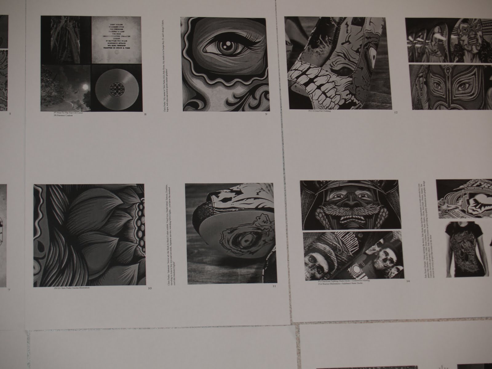
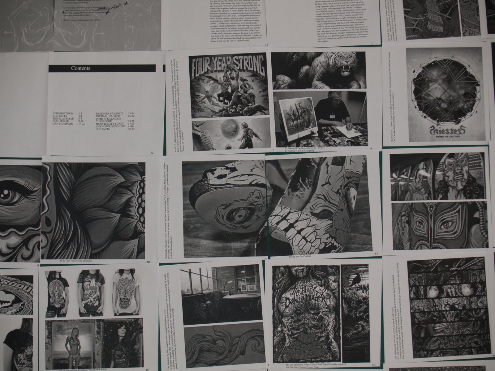
Before I sent off my book I wanted to make sure that everything looked correct and there were not any major mistakes in distortion of imagery or typos/ a physical feel for the layout and composition theory.


Once I knew what the layout was like I cut up the pages to get an idea of what it would look and feel like when it was printed.


All the pages seemed to be aligned correctly and look how I had intended them to.


The next step is to alter all of the main mistakes I made and make the main body into a PDF, after this I need to come up with a cover and title.


I really want to find out who the designer is for these t's the colour and type are really interesting and I would like to see a better more focused photo/s of his/her work.
Four year strongs covers are really sick, the designs are really inspiring and educating, Two colour pantone is used in this image and it looks really good.


Never lack imagination, this is an amazing idea and incorporates all sorts of elements, metal space sharks, water creatures in space, wizards, planets and magic, wowza.


On a more serious note, these illustrations are more detailed and have been layered so well, I want one of my t's to incorporate these factors and some possible symmetry + a lack of colours used black and red seems really cool.
I really need to know who did this album cover as it is one of the most humorous and amazing illustrations I have seen. The detail is unreal and the inspiration for imagination is uncanny Im going to email them and find out, hopefully they will have time to reply.
The colours in this are really interesting and are very aqua based, I like that idea.
molten sun like.
mutation of animals almost, siamese rhinos, crazy business.
This is un real and is one of my favourite designs, It is formed from basic paint strokes to build a much bigger image. It was beyond me how it was possible to design something like this until I really examined it and found that the blue backing is simple woodland, and the artist most likely got a image of trees and traced over it using different strokes such as this to get a bold effect, the majority of the back ground is black.

Thursday, 19 May 2011

Book layout in digital.

I didn't document a lot of the different ways I played with where my text and images were placed as I wanted to focus on the product rather than the documentation of the story, Below is one of the few images in this post which is manipulated.


I really liked the way this layout flowed and just looked really natural and was an ease for the eyes.


It took me hours to work out how and what I wanted to include in my introduction, there were was a lot of different examples and layouts I attempted before I was happy but none of them seemed really right until I got to this one:


This first image is of fantasy artists very own, Ken Kelly. I included all the relevant information I gathered from research and quotes as with interviews I have taken over email but essentially this is the layout I want to carry forth with the rest of my book as the main focus is within the imagery and not the text, But the text is not left out.


At the bottom of the page on the right hand side I include a small bit of type informing what is on the page and who it is by.


Pale horse design were my main focus and I included some really inspiring double page spreads which were in my opinion 'sick'. Im not sure how they will look when lulu have printed it but fingers crossed it should turn out alright.


I wanted to add quite a bit of 3D work into my book to show that it is not all just a piece of paper and illustration can be manipulated in so many different inspiring ways.


Unfortunately I could not find the artist who produced this traditional tattoo art but just because of that didn't mean I did not want to include it in my book.


Lined up from the left contact list.