
Showing posts with label OUGD303DP. Show all posts
Showing posts with label OUGD303DP. Show all posts
Friday, 3 June 2011

Thursday, 2 June 2011
Better late than never
I should of posted these images up along time ago although I have been unable to find the lead to my camera until recently.
Below is some experimentation using a stationary stamp and and different coloured inks to figure out a packaging packing and surface.
I found that a thin tissue paper worked perfectly most particularly with the collaged design linking together making a bigger more interesting picture.


Wednesday, 1 June 2011


Tuesday, 31 May 2011
CD wallet, CD and Ticket
As I changed the concept for the logo I chose to change the cover to make it more appropriate.
I kept the three to the same theme so they worked together as a set, I also thought that is would be a relevant idea to save on print costs by producing tickets which were bought online and printed off.


Monday, 30 May 2011


Sunday, 29 May 2011


In context
To show my skateboards in context I wanted to put my boards in a rural context like a woodland area to show off full potential.


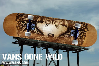


I came up with a few interesting ideas I wanted to try out one was a crazy bill board which was of a giant skate deck hanging from the sky, the others were pretty simple and I wanted to just have them advertised in a magazine such as Skate or inline.


Friday, 27 May 2011
Deck set.
So I got the last board engraved today and in all honesty I believe it had the weakest reaction to the laser and I am not very happy with the outcome in comparison to the other skate decks it holds not only the weakest image but now also the weakest result which is a let down.


At least I know that for future reference when ordering maple wood to look at the different tones, each deck is the different in wood tone which is a rookie mistake on my department.
Although the board came out with a weak engrave I do think it is very much needed in order for it to work in the set.


Wednesday, 25 May 2011
Colour exploitation
Snowboarding is commonly known for how excessive the colours are and vibrant equipment can be when out there, I wanted to use the vector images and create a kind of tropical camo effect.


Below are some screen shots of different colours I found interesting during the process.


Snowsports
I mocked up some possible snowboard ideas for UCLAN mixing typography and illustration together I think that I will combine two of the boards together for an interesting final design outcome.


Final logo
After altering the positioning of my work and exchanging the typeface I had to find one which I was happy with and could leave alone it came to my attention that I needed the image and type to fit together in order to work after a while I realised that if I changed the order of the imagery so the UCLAN logo was in the centre with the vector illustrations either side it gave more of a steady flow towards the logo as a whole.


Oh Lu Lu...
I have been struggling with uploading my PDF to my blog due to html sites not working correctly on my macbook.


However I got the context book through the door the other day made by Lu Lu, unfortunately some areas of the book had came back incorrect and I was not to pleased by outcomes these areas include:
Spacing between type and photos on the bottom right pages.
Blurred front cover
High resolution photographs/ images being blurry
If I had time I would have the book remade although there is not enough time for it to be delivered to the UK in time for deadline, instead I will give a full evaluation on how the book went beginning to end.


Subscribe to:
Posts (Atom)