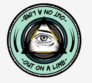
For the logo I used what I had sketched out as a beginning point for my design, I wanted the colours to be subtle yet stand out which is why I chose an Aztec gold and a denim blue.
I wasn't sure about having the type at the bottom of the logo as it didn't appear how I wanted it to, I felt that the logo should be in much more of a circular format for it to truly make sense.


No comments:
Post a Comment