
Taking a deeper look towards different illustrations and designers whom produce what I really love I found two designers whom offer so much in inspiration and are amazing contacts who I could benefit for gaining feedback. I however need to finish this drop dead brief in order to have a portfolio of designs like this to be evaluated. There is no point taking screen prints to a photographer.


Below is an image from vitale studio in which the designer has used basic contrasting colours black and white to create an interesting victorian background. The white strike through around the hand creates such a strong depth, it just shows how sometimes something so simple can really make something stand out.

Some of this art work is from palehourse design, a design firm based in St. Petersberg. The depth they go in with illustrations is fantastic, they create such an indepth and interesting background for art work, I really love how the colours used are like a tim burtons alice in wonderland, designs like this are what I want to aspire to with due time.

This owl is really amazing as the strokes above the eyes really create a strong appearance, although in looking at this image I have learned little tricks to make such a good design and in half the time. The image is se-metrical which means that only half the owl was actually drawn and the rest is simply a mirror reflection and has been aligned to fit in.

As with the owl image, the tiger is the same, I still think that the image is amazing and gives such depth, this is a way in working I should consider as I could add twice as much detail as normal and simply reflect it and have a stronger image.

This is slightly different as it is only the sake and background which has been mirrored the artist as simply added different reflection tones and added different features to the product to make it as it is, the gold makes the image really glow.

This is a reflection again although the face of the right Egyptian king has had more detail added and made skeleton fragmented. I believe this would of looked a lot better and more creative if both images were not trapped in two boxes, I think that the boxes take away from the image and destroy quite a lot of hard work.

This is a printed out version of one of the illustrations on what seems to be a magazine cover, the image looks really great as it is printed on a gloss finish which makes it shiney and gives the colours a chance to really shine.

Simple black and white, early stage of development, this image has yet to be coloured in or have any tones added but it is easy to see what the image can look like when it is finished and taken further with development.

These images are from drop dead, the images are quite simple and child like but the characters are very interesting especially the one on the left, the use of different green tints makes this image really stand out.


This is a smart idea featuring some hands touching were the persons chest would be wearing the t shirt, cheeky... I think this is a great idea incorporating illustration in with physical components such as the human body its self. this imagery is from the band the secret handshake.

As can be seen below in the bikini, the imagery of the clothing alone is a smart idea for design but when put into the context of the body it gives the item a sex appeal. The person sees someone wearing it and what it looks like on and then desires to own it.

This is a smart image linking in the Japanese woman with the samurai mask on the back of the fan, put into the placement of where the fan is placed it creates an illusion that the woman only has half a face, which then adds a debate on what the image really means, why her eyes are red, why the mask is laughing etc.

Early stage of sketching, this would be the first stage where the artist would then carry on a deeper detail of the drawing progressing into pen, then digital and then colour.

Dont be limited to what you produce for, phone covers for black berries and I phones are some of the most essential markets available, those are the two phones which are more commonly used rather than anyone else.

This image is based around blues and purples and creates a cold emotional kind of feel when looked at, the stroke work looks amazing, I am a big fan of using backgrounds such as this.

Black and gold to me is the best colours to use on duo print, I think that it creates such a rich look and is visually embracing when looked at.

Again, do not be restricted to what you produce for, these images look amazing as someone has used a vector image and applied it to cans, which look really cool.

Moving on to my final designer Dan Mumford.

Mumford is from America but is not based in Central London, he produces work for album covers, t - shirts and posters. I believe that looking at some of these images is astonishing, I love how the detail is so realistic and the tones of colour makes the imagery look as though it is a painting.

Dan produces art work for some of my favourite bands, his work is so simple in the gallows cover but it looks really cool as the wolves look demented, the use of colour is what makes it really zing.

This is a highly detailed piece he produced, I love the wire wrapping and the uses of purple, it just goes to show you don't need to go crazy with colours and if you stick with one tone it may be better for the whole project.

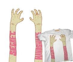
This is some work he did for drop dead, I love how he used a lime green for the type and made it appear as though it is web, this is something I need to do in order for my design to work.

Drop dead are made up from the band bring me the horizon, this band has Dan do the illustration work for the covers and It looks really raw.

His work is a great inspiration and I think that the imagery looks astonishing, the composition works really well, the fact that Dan can produce such relevant type is what makes the images work.

This is just amazing, very heavy metal, the colours are really well thought out, the type looks as though it is wrote in fireworks.

One colour art, this reminds me of the old illustrations in books dated back to the 1400's The use of one colour on this makes it so special, the tone is remarkable and just looks incredible.

Sometimes art work on a black backing takes away, seeing the imagery on a white background is un real sometimes, I believe white is a boring colour but it shouldn't be dismissed.

Below is a video of Dan Mumford's productions going to print, the t -shirts are done so fast and the machine just shoots out a lot of the work which makes the feel of production seem such a thrill and excites me, I hope to one day be able to experience this.
No comments:
Post a Comment