Blog Archive

Friday, 3 June 2011

Evaluation

Rationale: Illustrative driven graphic designer that focuses on different contexts for product and distribution.

I have discovered more about design in this passed 6 months than I have ever before in a module. As far as my rationale is concerned I stuck to it throughout the FMP although on certain briefs I was not able to afford final products due to lack of funding (Brief 2 and Brief 4) in knowing this I believe that a lot of the design possibilities lacked because I knew there was no way I could produce the final outcome. It took a tutorial to really snap out of what i was doing and extend my briefs and put more of a focus on them.

I discovered a lot of valuable industry qualities during this FMP such as how to talk to clients, produce books in retail, use facilities, experiment with materials, order in bulk and wholesale. There were a lot of amazing skills I got out of this although there were a lot of mistakes that went on along the way, Brief one was a slow brief and took months to complete due to waiting for certain facilities to be used. Brief two was a similar one, I seemed to be dragging the work on forever without a focus, it was only within the last few weeks I evaluated everything and made decisions which took a lot longer than I care to admit. Brief 3 was to vague and struggled to acquire a real definition in it being a significant brief until again it was fully assessed and extended into a retail brief which focused on putting work out on the market. Brief 4 was an annoying brief due to it being live and the client had no idea what she wanted out of the brief which led to a lot of mis used designing as I produced a lot of different styled work and received no positive feedback yet no idea of what was going to be changed, in the end I took the brief where I wanted to which made me feel a lot more free to explore different possibilities and extensions.

The design context book was a strong investigation into illustration for me although there were certain disasters which happened on return of production. One of which is that a lot of the images are blurred and that the front cover is awful and pixelated when the same image had been used on the first few leaves and had came out perfect. Only after it had been printed I noticed a few mistakes and things which should have been justified yet I didn't have a problem with them when I mocked the book out in rough. If I had the chance to print again I would take more time to experiment with posable covers which would not turn out pixelated or at least complain about what happened.

Regards the briefs I would like to continue some such as brief 2, 3 and 4 after hand in to produce the 3D outcomes for my portfolio.

I found that indexhibit is an awful site to use as it has been nothing but trouble. over the passed week I have struggled accessing the CPANEL and Content, Joe Gilmore was able to help me eventually although now I cannot log into my domain, which is really annoying as I have bought the name and it is on my business card. I have put all my website contents on a substitute site located at www.cargocollective.com/ifd
I am hoping I am hoping I can manage to get onto indexhibit in the next few days to either transfer all my data over or put a redirection link to my work

WEBSITE CHANGE

www.cargocollective.com/IFD/

Thursday, 2 June 2011

BRIEFS


Better late than never

I should of posted these images up along time ago although I have been unable to find the lead to my camera until recently.

Below is some experimentation using a stationary stamp and and different coloured inks to figure out a packaging packing and surface.

I found that a thin tissue paper worked perfectly most particularly with the collaged design linking together making a bigger more interesting picture.


Tuesday, 31 May 2011

CD wallet, CD and Ticket

As I changed the concept for the logo I chose to change the cover to make it more appropriate.
I kept the three to the same theme so they worked together as a set, I also thought that is would be a relevant idea to save on print costs by producing tickets which were bought online and printed off.


Monday, 30 May 2011

Below is the mock up production for UCLANS snowsports hoodie, 20102011 although I am pretty gutted that I was not able to produce the mock up in reality due to having a lack of money.

Below are a few images of the products produced in context.


Sunday, 29 May 2011

I wanted the Uclan stationary set to be very simple yet kind of street, I like the idea that is can be this bold and simple.

In context

To show my skateboards in context I wanted to put my boards in a rural context like a woodland area to show off full potential.

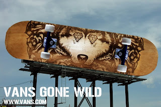
I came up with a few interesting ideas I wanted to try out one was a crazy bill board which was of a giant skate deck hanging from the sky, the others were pretty simple and I wanted to just have them advertised in a magazine such as Skate or inline.


Friday, 27 May 2011

Deck set.

So I got the last board engraved today and in all honesty I believe it had the weakest reaction to the laser and I am not very happy with the outcome in comparison to the other skate decks it holds not only the weakest image but now also the weakest result which is a let down.

At least I know that for future reference when ordering maple wood to look at the different tones, each deck is the different in wood tone which is a rookie mistake on my department.

Although the board came out with a weak engrave I do think it is very much needed in order for it to work in the set.


Wednesday, 25 May 2011

Website research

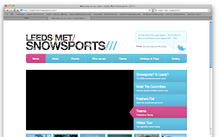
So it appears that a lot of the university snows ports teams across Britain are pretty crap with technology when it comes to:

A) Having a website
B) Maintaining a website
C) It actually working/ looking attracting


Colour exploitation

Snowboarding is commonly known for how excessive the colours are and vibrant equipment can be when out there, I wanted to use the vector images and create a kind of tropical camo effect.

Below are some screen shots of different colours I found interesting during the process.


Snowsports

I mocked up some possible snowboard ideas for UCLAN mixing typography and illustration together I think that I will combine two of the boards together for an interesting final design outcome.


Final logo

After altering the positioning of my work and exchanging the typeface I had to find one which I was happy with and could leave alone it came to my attention that I needed the image and type to fit together in order to work after a while I realised that if I changed the order of the imagery so the UCLAN logo was in the centre with the vector illustrations either side it gave more of a steady flow towards the logo as a whole.